|
|
Post by XxSuperShadicxX on Sept 2, 2013 2:30:42 GMT -5
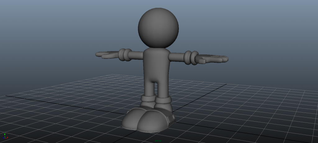 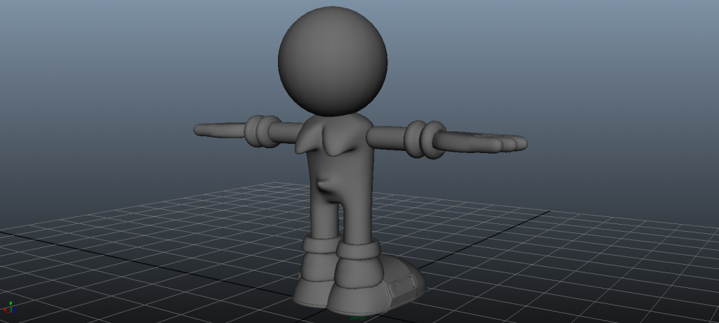 The hands are bad. I might fix them later. The sphere is a placeholder - it makes it feel complete. |
|
|
|
Post by Amnimate on Sept 2, 2013 6:55:08 GMT -5
Rappin Good. Although, the hands look a bit blocky, but I myself still didn't master the art of modelling the hands, and yours are still WIP. As for the head, please don't tell me your using a sphere. As much as you might be tempted, NEVER USE A SPHERE IN MODELING. EVER. I had to learn this the hard way, but whenever you want to have decent topology, use a cube, and smooth it a few times.You know how in BSU and LS5E2 in the test stage when you run around the sphere and you start to glitch-up at the bottom? Yeah, bad topology. Just use a cube and smooth it a few times, it'll make it easier on you. As for the socks, I see what you're going for, and it can actually turn out to be really good, but make them look a bit softer and move the socks up a bit from the back. On the gloves, same thing, make them softer. Also, the torso looks a bit flat, and since this is a chibi model I suggest making the torso a bit shorter, I think it's a bit tall. In the end, nice job! I have to give you props on the shoes, and for once the buckle on the shoes actually look like a buckle. The design looks simplistic and from here it can have hundreds of different results. Can't wait to see this finished! Sorry for my massive load of crappy critique  |
|
|
|
Post by XxSuperShadicxX on Sept 2, 2013 10:42:22 GMT -5
Thanks, but I would never use this circle. It's just a placeholder so it sorta looks complete in a way. I tried using a circle once in frag motion a LONG time ago and that was the worst thing ever, even though it was a bad modeling program. I'll definitely edit the socks and glove thingies - I see what you mean. And your critique is fine, it's helpful  |
|
|
|
Post by CRiTTER on Sept 2, 2013 10:59:26 GMT -5
Rappin Good. Although, the hands look a bit blocky, but I myself still didn't master the art of modelling the hands, and yours are still WIP. As for the head, please don't tell me your using a sphere. As much as you might be tempted, NEVER USE A SPHERE IN MODELING. EVER. I had to learn this the hard way, but whenever you want to have decent topology, use a cube, and smooth it a few times.You know how in BSU and LS5E2 in the test stage when you run around the sphere and you start to glitch-up at the bottom? Yeah, bad topology. Just use a cube and smooth it a few times, it'll make it easier on you. As for the socks, I see what you're going for, and it can actually turn out to be really good, but make them look a bit softer and move the socks up a bit from the back. On the gloves, same thing, make them softer. Also, the torso looks a bit flat, and since this is a chibi model I suggest making the torso a bit shorter, I think it's a bit tall. In the end, nice job! I have to give you props on the shoes, and for once the buckle on the shoes actually look like a buckle. The design looks simplistic and from here it can have hundreds of different results. Can't wait to see this finished! Sorry for my massive load of crappy critique  I agree with pretty much everything you said especially the rounder torso that is needed. Anyway really looking forward to this good luck  |
|
|
|
Post by XxSuperShadicxX on Sept 2, 2013 13:06:16 GMT -5
I'm using this as a reference  |
|
|
|
Post by crystalforce on Sept 2, 2013 15:49:02 GMT -5
Looking at the picture, his arms should be shorter, and maybe make the sphere on his head bigger.
Awwwwwwwww, so cute~
|
|
|
|
Post by XxSuperShadicxX on Sept 2, 2013 16:07:51 GMT -5
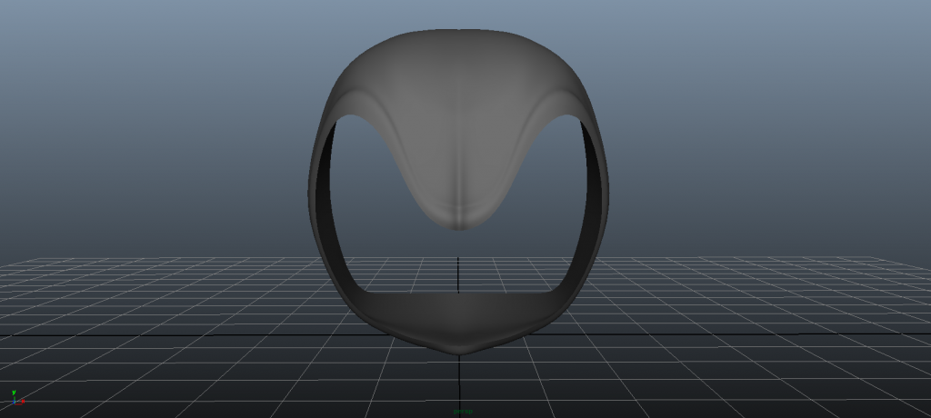 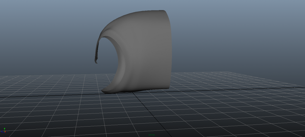 Okay, so I'm having a lot of trouble with this, it's really annoying. I know the back is squarish, I'll fix that later. The eyebrows are just pretty annoying. I tried to sort of copy/outline generations. Here's the ugly topology. 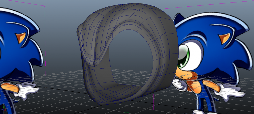 |
|
|
|
Post by XxSuperShadicxX on Sept 2, 2013 16:12:22 GMT -5
|
|
|
|
Post by Amnimate on Sept 2, 2013 16:21:03 GMT -5
This will take a while to describe. I have lots of homework to do right now I've been procrastinating on so you're gonna have to wait quite a bit, sorry  |
|
|
|
Post by XxSuperShadicxX on Sept 2, 2013 16:44:56 GMT -5
That's perfectly fine, you've been voluntarily giving me so much help out of kindness, anyway.
|
|
|
|
Post by Amnimate on Sept 3, 2013 8:17:04 GMT -5
I'll try to explain this quickly without going too in-depth. There are three good ways to model the head. Point to point, edge to edge, box modeling, or even a combination. Point to point: This is placing vertices in 3D space using your reference images as a guide. You'll need really good references to pull this off, is the hardest way to model, and isn't very rewarding. I don't recommend this for ANYTHING. Edge to edge: You may or may not need a reference depending on how well you vision your model. This is modeled by starting with a 3D plane and extruding more and more until you have a model. I suggest starting out with modeling the brows if you're doing this method. The good thing about this is that you can ensure good topology and a nice model. IF YOU DO IT RIGHT. If you don't then you'll have a model that looks like clay with bad topology. This is mostly used when modeling realistic humans or even parts of a car that box modeling just can't do. I think this method is a pretty good idea, but you need a good amount of skill to do properly and not make it look like clay and keep good topology. If you can master this, it's actually better than box modeling, but for now I highly suggest box modeling the head. Box modeling: Saving the best for last. This is where you start with a 3D shape, any shape, and carve it out. For this I suggest getting a cube and smooth it a few times (keep it as low poly for now). This is the best starting shape for Sonic's head. Delete faces for the eyes then move around the vertices to make it look better. Keep the muzzle part for now. Make an edge-loop around the eyes. Extrude the muzzle out, then shape it a bit. If you have enough polygons around, you can extrude out the ears at this point. If not then either add a new edgeloop around the ears to get enough polygons, rearrange the vertices, or if you truly can't do the other methods, smooth. Keep smoothing (by that I mean raising poly-count) in mind as a LAST RESORT. That was so important I had to put it in all caps. When box modeling it helps to keep your model as low poly as possible when modeling. You add in the finer details as you truly have no other option but to smooth. Push out the edges out and rearrange the vertices to get the eyebrows for now. Or you can extrude and move around the vertices for the eyebrows. Do any method you think works. Once your base model looks fine and you're sure there's nothing more you can add at this state, then you smooth. From here you fix up your model, fix the vertices, and add more details. I personally use a mixture of edge to edge and box modeling. It depends on what I'm modeling. You can use any method you want. Everyone has their own style. As for the quills, judging by how you deleted the half of the head, you know what to do. I just suggest adding the cylinders before you smooth. It keeps the edgeloops even, but you can still do it the other way around, if you're careful. I have more tips I'd really like to tell you that would help, but you know, I don't have much free time  Can't wait to see progress! |
|
|
|
Post by XxSuperShadicxX on Sept 3, 2013 12:24:38 GMT -5
Thanks so much! Last night I tried the edge to edge method (only finished the brows). I think I'll end up using the box and edge methods together.
|
|
|
|
Post by XxSuperShadicxX on Sept 3, 2013 21:58:30 GMT -5
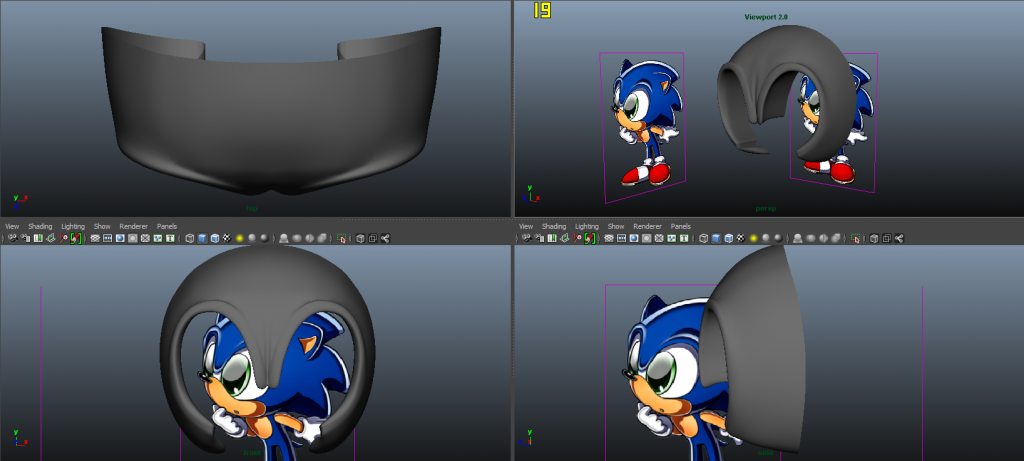 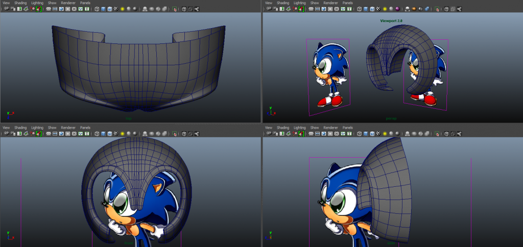 Here's what I have so far. I think it looks pretty good so far, excluding that part directly below the eyebrows. I was trying to figure out how to make it curve down like Generations/Unleashed because I want a separate muzzle. I think maybe either here or with another extrude backwards I can start the needles. I also might make the head slightly thinner. I looked at the official classic model to get a feel of how they brows connect to the head, so I tried to smooth and connect them to the head at the ends and middle. I might need to flatten out/smooth out the middle where they meet. I looked at some images again and realized it's more of a smooth curve instead of a 'W'. I also might need to make them more fuller and rounder. The only issue for now is how to make the outline for the muzzle. Here's a version of a smoother center brow 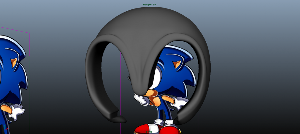 |
|
|
|
Post by Amnimate on Sept 4, 2013 1:20:58 GMT -5
Looking better! What SEGA usually does to compensate for the eyebrow roundness is to make the eyeball mesh go in more into the eyes and the inside of the eyebrow to close in. Look at the Unleashed model to see what I mean.
Also, about the muzzle, it doesn't have to be modeled separately. What I do now is model everything in one, then extract the muzzle and fix it up to be separate.
|
|
|
|
Post by XxSuperShadicxX on Sept 4, 2013 2:00:29 GMT -5
Okay, I see waht you mean. Also, do you think I should gradually merge the verticies in the middle of the head as they go back? They're so close; also is the edgeflow too important here, or does it matter at all?
|
|