|
|
Post by Relentless Scorpion (ssh) on Dec 3, 2011 23:28:14 GMT -5
Jesus, I'd think he'd be better off with a pet rock. At least their heads are softer. -,- |
|
|
|
Post by 06hypersonic60 on Dec 7, 2011 8:48:39 GMT -5
Here's a new menu: this time coded in GUI 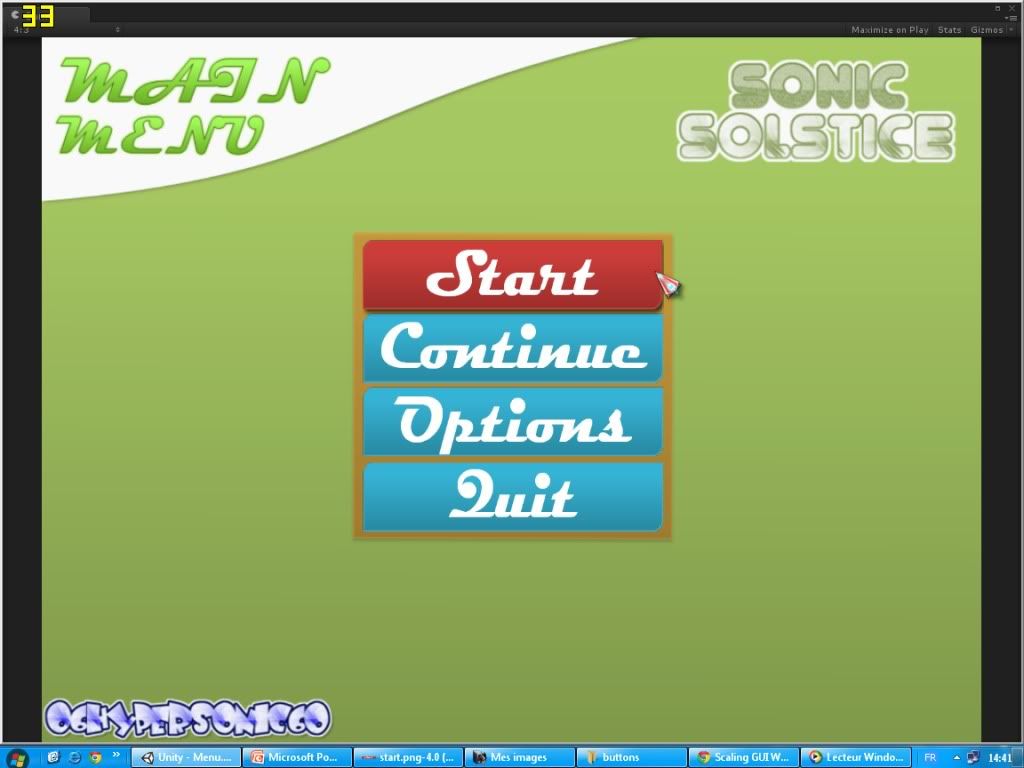 Also, that would be nice if someone can help me in music ( remixes ) |
|
|
|
Post by 06hypersonic60 on Dec 7, 2011 9:38:35 GMT -5
classic engine P.S: Ignore that model. It was there when I started woking on my project and I let him in this picture cuz I'm still working on sonic animations on blender to import them in unity 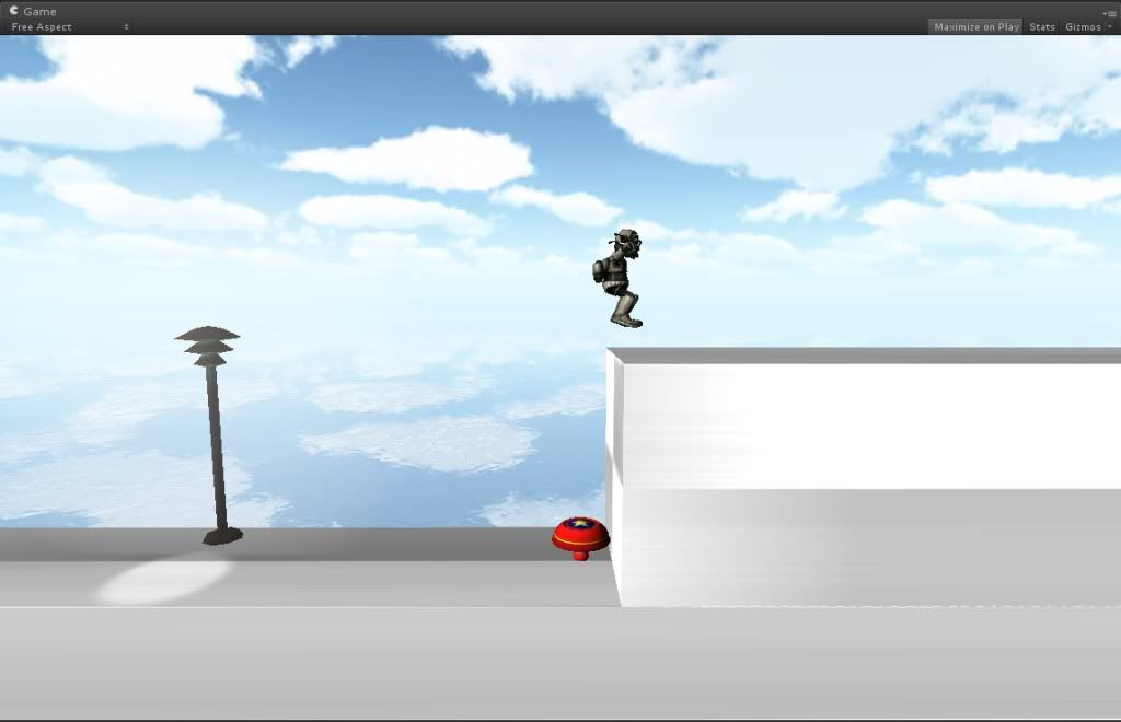 |
|
|
|
Post by 06hypersonic60 on Dec 7, 2011 9:50:09 GMT -5
|
|
|
|
Post by Th33z on Dec 7, 2011 13:55:21 GMT -5
the interface and everything looks amazing, wish you the best of luck friend!
|
|
|
|
Post by 06hypersonic60 on Dec 7, 2011 14:21:06 GMT -5
thanks ;D
|
|
|
|
Post by Relentless Scorpion (ssh) on Dec 7, 2011 18:14:35 GMT -5
this looks really good mate but seriously take a break from games you work to hard
|
|
|
|
Post by zankuujinmujinsho on Dec 7, 2011 18:59:54 GMT -5
If I were you, I'd scale those rings as they look wayyy too big when compared with the Spring.
|
|
|
|
Post by ShadowTG on Dec 8, 2011 2:59:00 GMT -5
This looks amazing mate! I can't wait to see what comes from this, it has a lot of potential.
|
|
|
|
Post by 06hypersonic60 on Dec 8, 2011 9:52:09 GMT -5
Some pictures for the 2D gameplay ( that model will be changed with C.sonic ) Classic engine have moving plateforms, respawn, pushable boxes and more... 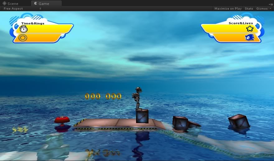 simple Underwater effect : 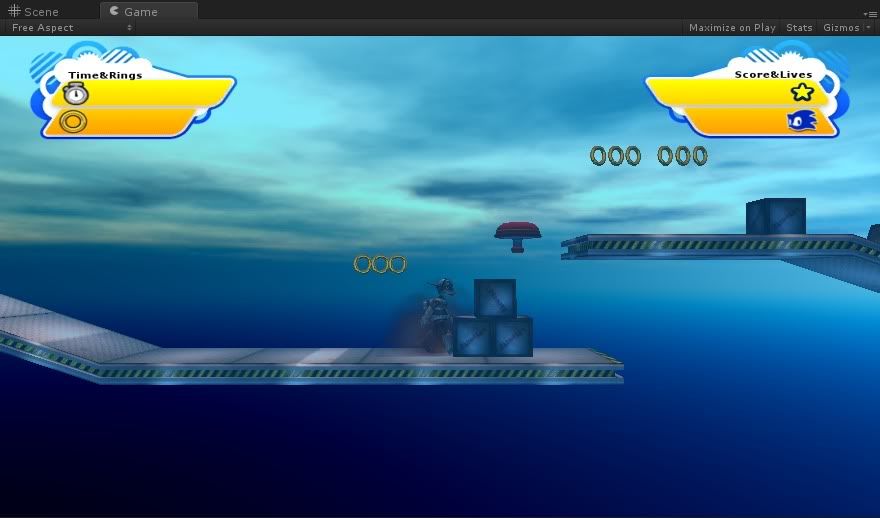 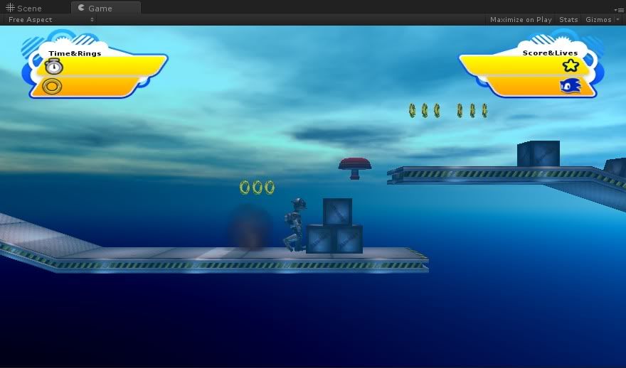 |
|
|
|
Post by Relentless Scorpion (ssh) on Dec 8, 2011 11:36:54 GMT -5
nnnnnnnnnnnnnnniiiiiiiiiiiiiiiiiiiiiiiiccccccccccccccccccccccceeeeeeeeeeeeeeeeeeeeeee
|
|
|
|
Post by XxSuperShadicxX on Dec 9, 2011 15:07:41 GMT -5
I think that you should try to make a different Interface instead of using generations' but with a color change.
|
|
|
|
Post by 8-Bit magic on Dec 9, 2011 23:39:40 GMT -5
that is so cool! i wish you the wisdom fit fopr a king. god luck on your long journey.
|
|
|
|
Post by 06hypersonic60 on Dec 10, 2011 3:27:41 GMT -5
I think that you should try to make a different Interface instead of using generations' but with a color change. I'm trying to make a new interface. And I didn't change any color in the generation hud. It was like that when I got it and it was ripped too |
|
|
|
Post by Relentless Scorpion (ssh) on Dec 10, 2011 5:04:21 GMT -5
yo ala i have been working on arcus all morning got some new improvements and boost bar design (also though if i say it here u will see it )
|
|